If you’re designing multilingual websites, especially those requiring fonts for Chinese, Japanese, or Korean, choosing the right typeface can make or break user trust and readability.
In particular, choosing the right fonts for Chinese websites ensures your content is legible and culturally appropriate.
Learn how to choose the best fonts for Chinese, Japanese, and Korean websites. Improve readability, SEO, and user trust with culturally appropriate, performance-optimized font stacks.
Table of Contents
- 1. Why Fonts Deserve Special Attention
- 2. What Fonts Work Best for Each Language?
- 3. Do You Need Separate Fonts for Each Language?
- 4. How Font Choice Impacts SEO and UX
- 5. Bonus Tips: Styling, Line Spacing, and Font Sizes
- 6. Practical Typography Tips for CJK Web Designers
- Conclusion
1. Why Fonts Deserve Special Attention
Visual Density and Complexity
- CJK languages use thousands of unique characters, compared to the ~26 letters in English.
- This means fonts must contain tens of thousands of glyphs — making file sizes and design considerations much more complex.
Font Rendering Matters
- Many browsers default to generic fallback fonts that may not render properly.
- For example, if a Korean font is missing, users may see Chinese characters instead — and vice versa.
Cultural Sensitivity
- A Chinese website using a Japanese-style font can confuse or alienate users.
- Even within China, Sans-serif fonts like Noto Sans SC are often preferred for digital reading, while Songti or serif fonts are used for more formal documents.
“A font isn’t just a design choice—it’s a cultural signal.” — Type Network
2. What Are the Best Fonts for Chinese, Japanese, and Korean 2025?
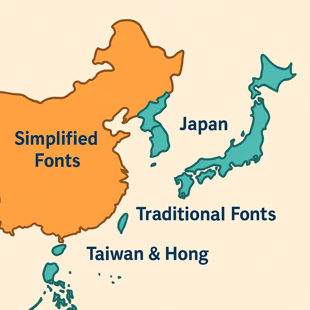
🇨🇳 Chinese (Simplified)
These are the most commonly used fonts for Chinese audiences in Simplified script regions like Mainland China and Singapore.:
🅰️ Noto Sans SC
🅰️ Source Han Sans SC (思源黑体 SC)
🍏 PingFang SC (Apple devices only)
Fallback Stack (CSS):font-family: 'Noto Sans SC', 'PingFang SC', 'Microsoft YaHei', sans-serif;
📝 Notes:
Best for Simplified Chinese users. Sans-serif fonts are easier to read on screens. Always test across macOS, Windows, and Android to ensure consistent rendering.
🇹🇼 Chinese (Traditional)
Many fonts for Chinese Traditional script are designed to evoke formality or heritage, making them ideal for legal, academic, or cultural content.
Recommended Fonts:
🅰️ Noto Sans TC
🅰️ Source Han Sans TC (思源黑体 TC)
🍏 PingFang TC (Apple devices only)
Fallback Stack (CSS):font-family: 'Noto Sans TC', 'PingFang TC', 'Heiti TC', sans-serif;
📝 Notes:
For Traditional Chinese users, consider more elegant styles. Avoid mixing Simplified and Traditional characters in the same sentence unless styled intentionally.
🇯🇵 Japanese
Preferred Region: Japan
Recommended Fonts:
🅰️ Noto Sans JP
🅰️ Yu Gothic UI
🍏 Hiragino Sans (Apple devices only)
Fallback Stack (CSS):font-family: 'Noto Sans JP', 'Yu Gothic UI', 'Hiragino Sans', sans-serif;
📝 Notes:
Fonts must support kanji + kana. Be careful with proportional spacing. Some kana can appear too small if line height isn’t adjusted.
🇰🇷 Korean
Preferred Region: South Korea
Recommended Fonts:
🅰️ Noto Sans KR
🅰️ Nanum Gothic
🍏 Apple SD Gothic Neo
Fallback Stack (CSS):font-family: 'Noto Sans KR', 'Nanum Gothic', 'Malgun Gothic', sans-serif;
📝 Notes:
Hangul line spacing varies widely across fonts. Test in Chrome, Safari, and mobile views to avoid compressed or overly loose text.
3. Do You Need Separate Fonts for Each Language?

Short Answer: Yes, If You Want Cultural Accuracy
- Fonts for Chinese are engineered with different typographic principles than those for Japanese or Korean, especially in stroke thickness and spacing.
- However, multi-lingual typefaces like Source Han Sans or Noto Sans CJK offer unified design across languages, but they’re large in size (15MB+ uncompressed).
Optimization Tip
For static sites, preload only the languages needed for the visitor’s locale.
Use subset fonts with only required characters using tools like Google Fonts Subsetter.
4. How Font Choice Impacts SEO and UX
SEO
- Fonts affect page speed. Heavy fonts slow down mobile load times, which affects Core Web Vitals.
- Google can index text in web fonts if loaded properly.
- Avoid using text in images — it’s not indexable and hurts accessibility.
User Experience (UX)
- Well-chosen fonts reduce cognitive load, making reading smoother.
- Culturally appropriate fonts build user trust — especially important for industries like finance, health, and education.
5. Bonus Tips: Styling, Line Spacing, and Font Sizes
Line Height
- Use 1.5 to 1.8em for CJK text — characters are denser and need vertical breathing room.
Font Sizes
- Body text: 16–18px for Chinese and Korean
- Japanese kana: can appear smaller, so test with users
Style Consistency
- Don’t mix Traditional and Simplified characters.
- Avoid combining Latin and CJK fonts in the same sentence unless carefully styled.
Web Safe Fonts (for fallback)
'Microsoft YaHei'(Windows)'PingFang SC'(macOS)'Apple SD Gothic Neo'(macOS)'Malgun Gothic'(Windows Korean)
6. Practical Typography Tips for CJK Web Designers
✅ Use font-display: swap
This ensures fallback fonts appear immediately, improving first contentful paint (FCP).
@font-face {
  font-display: swap;
}
✅ Avoid full-style downloads
Use WOFF2 format and limit font weights (e.g., only regular + bold) to reduce load times.
✅ Preload key fonts
In your HTML <head>:
<link rel="preload" as="font" type="font/woff2" crossorigin href="/fonts/NotoSansSC-Regular.woff2">✅ Always test on local devices
Fonts render differently on Windows, macOS, and mobile — check your designs across environments.
✅ Respect vertical rhythm
Balance line-height with font size so characters don’t feel cramped, especially in vertical scripts or hybrid layouts.
Conclusion: Pick Fonts that Speak Your Audience’s Language
👉How to Translate Chinese Writing: A Beginner-Friendly Guide
👉Should You Use Google Translate for Chinese? 3 Reasons to Think Twice
👉Are Translation Apps Rude to Use When Traveling?
Your website’s font isn’t just a design decision — it’s a strategic move. With the right CJK font setup, you improve comprehension, build trust, and deliver better results.
Start small: pick fonts that fit your users’ location and platform. Optimize for speed. Test and adjust. Your readers will notice — and stay longer.
If you’re not sure which fonts work best for your project, reach out — we’d be happy to help you create a font stack that works beautifully across Chinese, Japanese, and Korean screens.
👉 Contact us today to discuss your project and get expert guidance on building the perfect CJK font strategy for your website.
