Learn the 5 biggest website localization differences between Chinese and Western websites, from layout to UX. Essential for anyone localizing digital content for China.
READ MORE >>> 5 Challenges of Chinese Translators When Working on Projects
1. The amount of information per page – A Key Localization Difference
One of the most significant differences between western and Chinese websites is that the latter is busier, more cluttered, and more detailed on content, making sure that the visitors can read and browse everything they need on a page.
But western websites are cleaner, and they maximize the white spaces on the content. They provide an overview or highlight of their products and services using short, punchy texts.
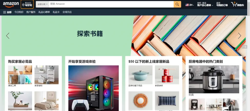
For example, Amazon’s minimalistic and less scroll layout (left pic above) look enticing to the western audience with a simple layout of content, photos, and short descriptions.
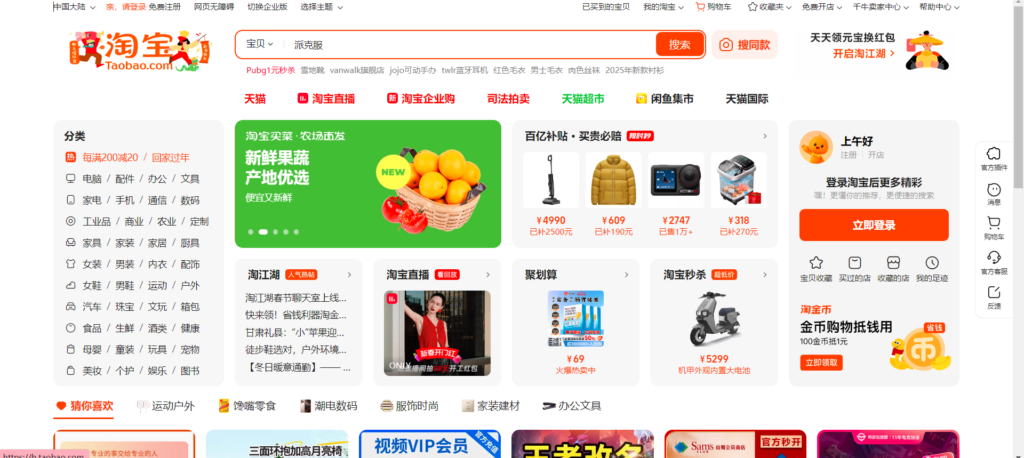
When you look at Taobao, China’s leading e-commerce platform, you get to browse and read more texts, advertisements, flashy pop-up ads, and more scroll.
2. The page length
When you browse the English version of Amazon and compare it with the Chinese version, the latter is longer than the former — a clear localization difference that reflects the Chinese preference for more on-page content.
The Chinese version provides more content, making the page longer – texts, images, pop-up ad, links, and more.
3. Categorization of content
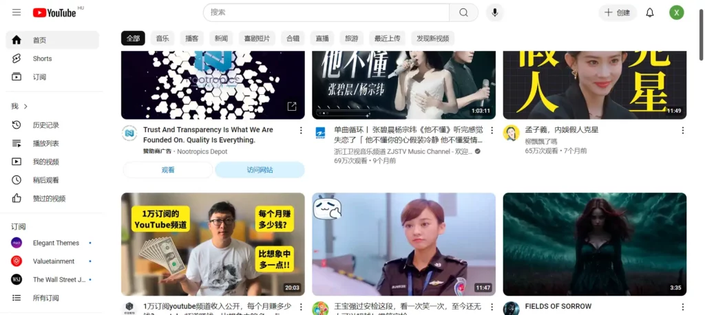
You’ll also notice the differences between YouTube and Youku. The former has three main categories for users—Home, trending, subscriptions. It’s simple and straightforward, right?
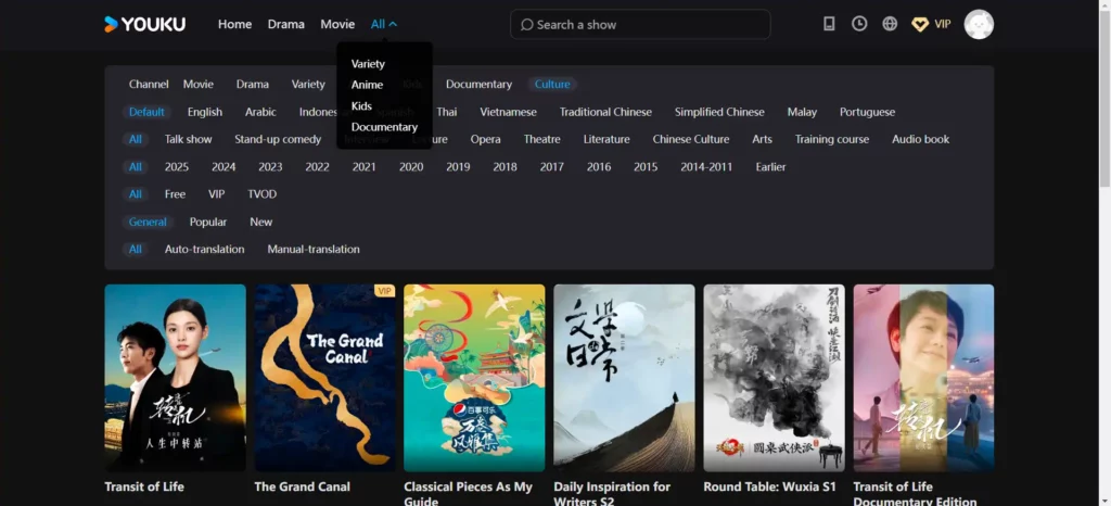
However, on Youku, one of China’s popular video platforms, you’ll see the 21 categories on the menu – from Homepage to tourism and the drop-down has sub-categories.
4. Full of colorful designs, pop-ups, and ads
One of the best practices in web design for the western audience is the consistency of the branding such as the hex colors of buttons, ads, font color, size and font face.
But when it comes to Chinese websites, you sometimes break these rules and instead use colorful, flashy graphics to draw attention. Banners have different sizes and striking colors.
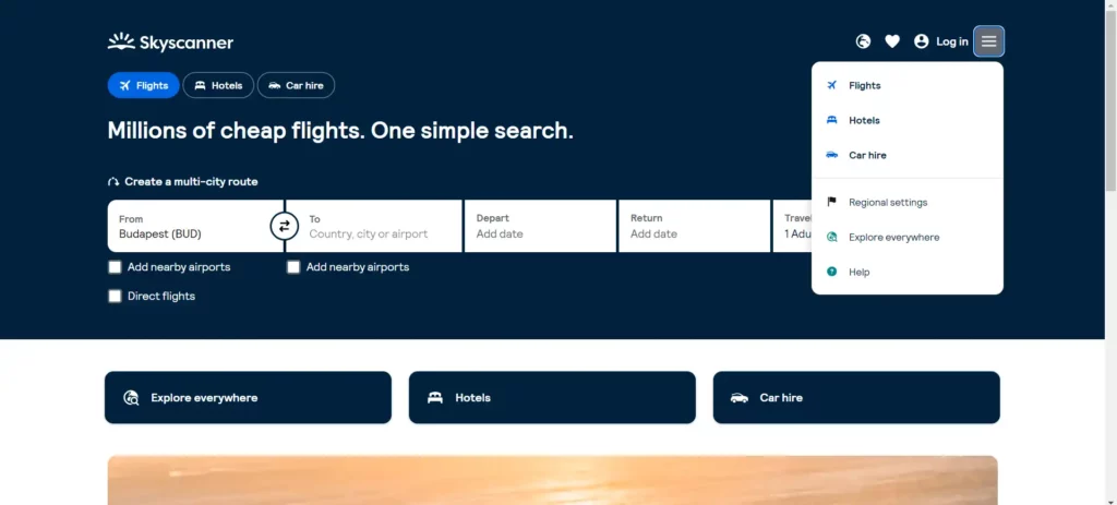
Above are screen grabs of Skyscanner’s website in English and Qunar, one of China’s popular online ticketing site. Do you see the differences?
Qunar has a longer page compared to Skyscanner; the content and links are crammed into one page
5. QR codes are indispensable CTAs
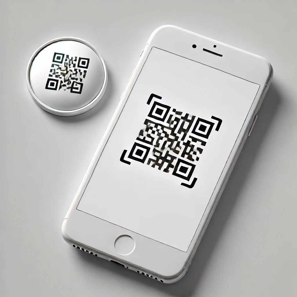
QR codes are the most important elements – as call-to-action buttons – on Chinese websites and apps. It’s a nuisance to type the Chinese characters on the URL, scanning a code using a mobile phone makes it more convenient to download an app, opt-in for a particular subscription, follow an account, or get promotional deals.
Typography and Font Preferences – A Subtle but Important Localization Factor
One aspect that’s often overlooked in digital localization for China is typography .Western websites often favor sleek, thin fonts or serif typefaces for elegance and brand personality. However, these styles don’t always display well with Chinese characters, especially on smaller screens or lower-resolution devices.
Chinese websites typically use sans-serif fonts like Microsoft YaHei or PingFang SC, which provide better readability for dense characters and varying stroke widths. In addition, font sizes on Chinese websites tend to be slightly larger to enhance legibility, particularly for older users or those browsing on mobile devices.
For example, a Western luxury brand site may use a delicate serif font to convey sophistication, but in the Chinese localized version, switching to a clean sans-serif ensures that product names, descriptions, and calls-to-action remain crisp and easy to read. This small adjustment in typography can have a significant impact on user experience and engagement.
Ready to tackle your website localization for the Chinese market? Our team specializes in delivering user-friendly, culturally relevant designs based on proven localization differences between Chinese and Western websites. From layout to UX, we ensure every detail meets your audience’s expectations. Contact us today to start your localization project and get expert guidance tailored to your business goals.
