If you’ve ever browsed both Western and Chinese websites, you’ve probably sensed a big difference — even if you couldn’t quite explain why. From layout and design to how users interact with content, these differences say a lot about each market’s digital habits and consumer psychology.
Recognizing these variations can give you powerful insights for localization strategies, especially when adapting your site’s UI/UX and content for a Chinese audience.
The differences between Western and Chinese websites aren’t just design choices — they reflect user expectations, browsing behaviors, and cultural preferences. If you want to localize your website for China, simply translating the words isn’t enough.
You’ll need to adapt:
- Layout and content flow
- CTA design (especially with QR codes)
- Visual intensity and hierarchy
- Navigation style and depth
1. The Amount of Information on Each Page
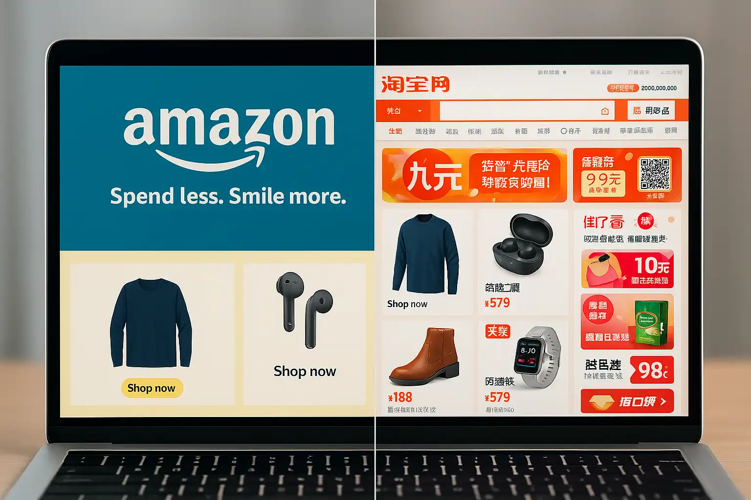
Western websites typically focus on simplicity and minimalism. They use whitespace strategically and favor short, punchy descriptions — think of Amazon’s clean product pages or Apple’s spacious landing screens.
In contrast, Chinese websites are content-rich and visually dense. Platforms like Taobao prioritize packing in as much detail as possible — including prices, offers, pop-ups, scrolling banners, and links — all designed to keep the user informed and engaged without clicking away.

👉 Taobao shows everything up front. Amazon invites you to explore further.
2. Page Length and Vertical Scrolling
If you compare the English and Chinese versions of Amazon, you’ll immediately notice: the Chinese version is much longer. And this is not unique to Amazon.
Chinese users are comfortable with long-scroll pages filled with text, images, links, and pop-ups. They expect a page to offer almost everything they need in one scrollable view. Western users, by contrast, prefer concise overviews with separate, deeper links.
3. Content Categorization and Menu Structure

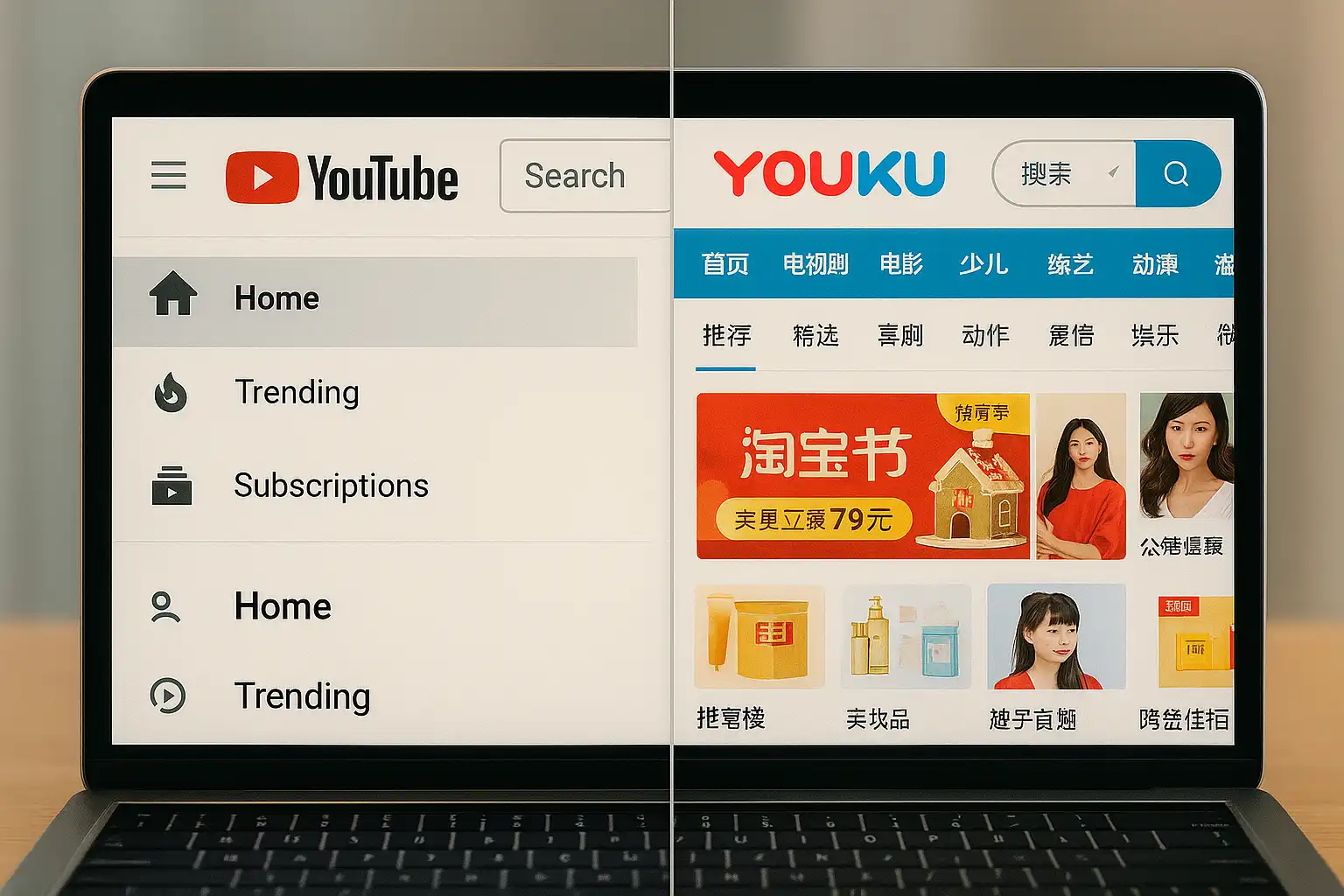
Western platforms often favor simple navigation. For instance, YouTube features just a few top-level categories: Home, Trending, and Subscriptions.
Meanwhile, China’s Youku offers a far more segmented experience, with 21+ categories — from Movies and Drama to Education and Tourism — and multiple layers of drop-down submenus.
This reflects the Chinese user’s preference for extensive filtering and structured exploration.
4. Use of Colors, Pop-Ups, and Visual Design
Western design best practices prioritize:
- Brand consistency
- Hex color control
- Limited font families
- Visual hierarchy

Chinese websites often break those rules — on purpose. Why? Because attention-grabbing visuals work in the Chinese context.
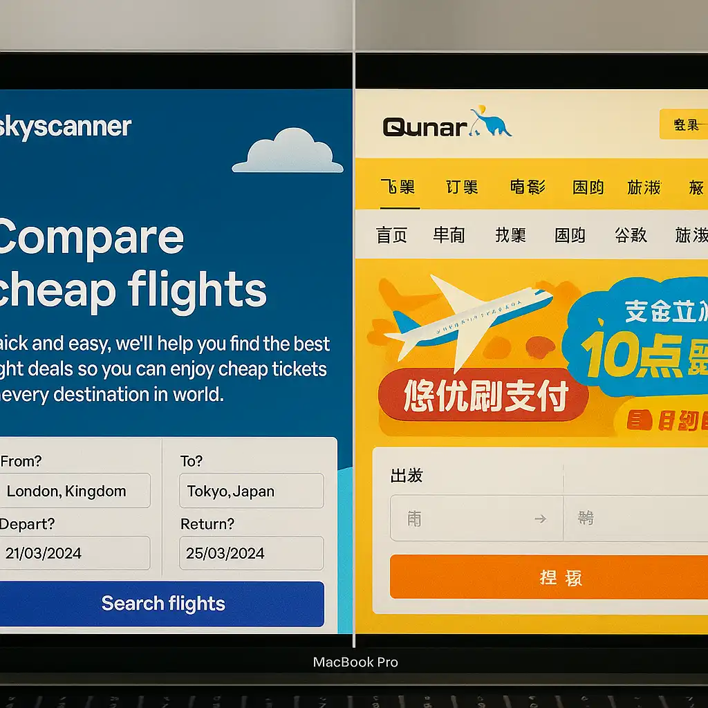
Sites like Qunar (a travel booking platform) use:
- Bright, mixed colors
- Multiple font types and sizes
- Flashing banners and animated ads
- Dense layouts with minimal whitespace
Compare this with Skyscanner’s English site, and you’ll see the contrast instantly.
5. QR Codes as Primary CTAs
In the West, CTAs tend to be buttons: “Sign up,” “Download app,” “Read more.”
In China, the QR code is king.

Users don’t want to type a long URL in Chinese characters. They want to scan and go — whether it’s to download an app, follow a brand’s WeChat, join a promo, or access exclusive offers.
Take Skyscanner again. Its Chinese site features a prominent QR code CTA, while its English site sticks to traditional button links.
Ready to Localize Your Website for China?
At AZ-Loc, we help businesses go beyond translation. Our website localization experts understand how to adapt your UI/UX, visual elements, and calls to action for real Chinese users.
👉 Let’s make your website not just translated — but truly local.
